This is another one of those live blog post that I write while I do some data analyses. I hope you find this interested to see how we approach the analytic process and the types of questions that we want to answer.
The focus today is on the CDC-RISE project. We have five major evaluation questions that we’ve been digging into over the past year.
- How does RISE improve community capacity to address vaccine hesitancy in underserved communities?
- How do COVID-related messages reach racial and ethnic minorities, relative to comparison communities and baseline?
- How did minoritized racial and ethnic populations, and other socially vulnerable people access healthcare and social services through RISE activities?
- What are the comparative rates of COVID-19 testing and vaccination for racial and ethnic minorities in highly impacted geographic regions?
- How did communities support response, recovery, and resilience for racial and ethnic minorities, rural areas, and low-income communities?
I’m not going to get into the community-specific data but rather trends that we’re seeing across all the communities involved in this initiative. Hat’s off to Dr. Mary Mitsdarffer, who has to still get me her info to put up on the website for collecting all this data.
Background
RISE is composed on ten teams, working collective in 102 distinct counties, covering a total of 18.7 Million people. These aren’t the big cities; there are a lot of very rural counties within this set.
Relationships between demographic characteristics.
The CDC data shows us a few variables that get at some of the social determinants of health. I plotted a correlation matrix that shows the statistically significant relationships between these variables. There are a few things that stand out below.
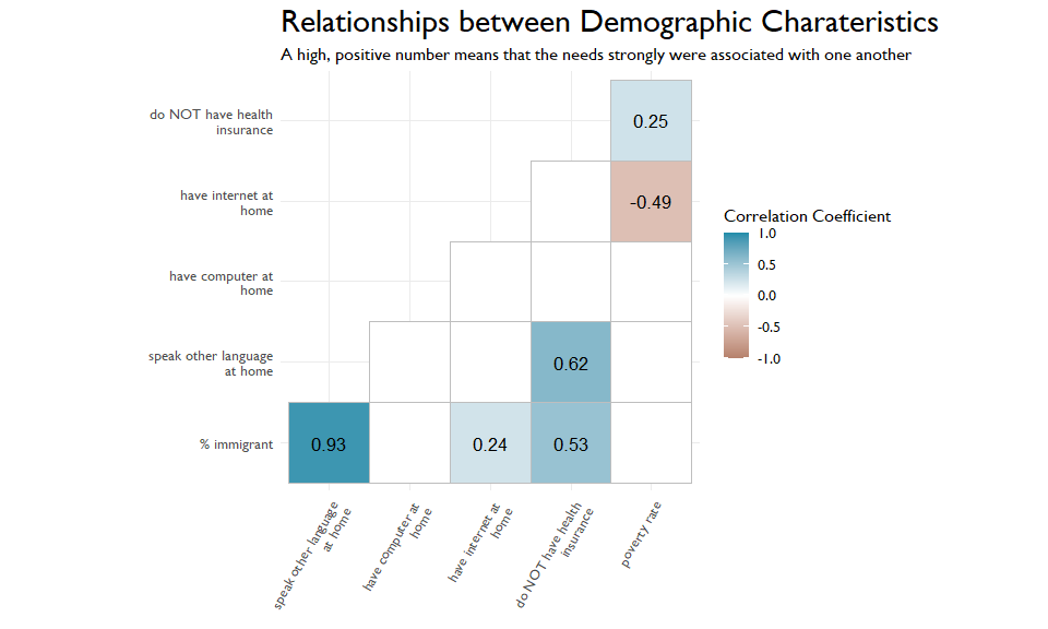
First is the strong, negative relationship between poverty and having internet at home. Let’s unpack that. If you are an organization trying to reach people in poverty, is a digital content strategy your best bet? We also can see a strong, positive relationship between speaking another language at home and not having health insurance. Again, this potentially speaks to access and how we can best reach these marginalized populations.
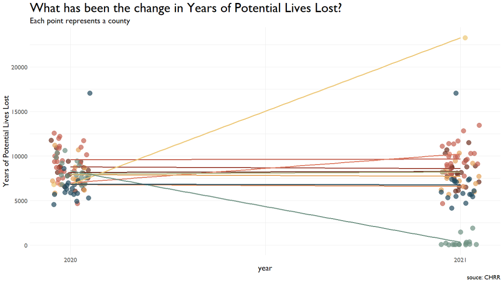
Change in Potential Lives Lost
One metric the CDC tracks are Years of Potential Lives Lost. This metric was very steady across most communities, with one showing a vast improvement from 2020 to 2021 (note that a lower score here is better.) So, think about this for a second. This specific team in the light green at the drops to scores between ~2000 and the 80s. They had a drop of about 8000 Years of Potential Lives Lost. This means that they have saved about 105 entire lives. Nice freaking work.
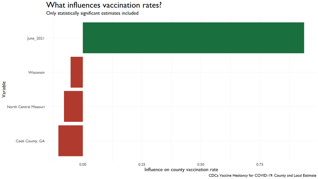
Influences on Vaccination Rates
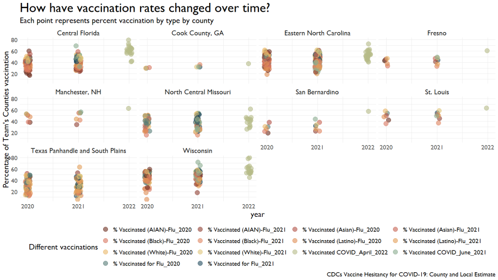
We have a ton of data on different vaccination rates for different diseases. This first graph shows the comparative rates over the last three years for various conditions.
I ran a simple regression to see what contributed (or inhibited) to improved vaccination rates. I was looking to see if other vaccination rates predicted COVID vaccination rates, but we were running into too much missing data, causing the models to fail.
I had to default to something a little simpler, using the Social Vulnerability Index. We can see that people in Very High Vulnerability areas were less likely to get vaccinations by June of last year.
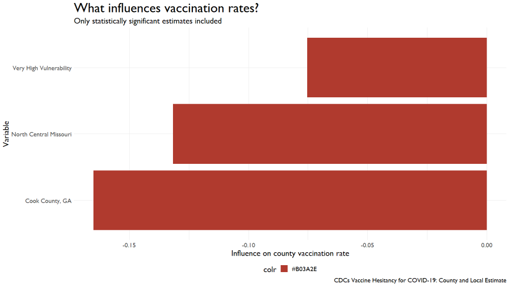
This influence was wiped out by April of this year, with vaccinations from last year exerting a huge influence on this year’s rates.
Summing up
We’ve got more data to crunch through, so be prepared for many, many more blog posts on this topic.