
Usain Bolt is synonymous with speed, precision, and an unyielding drive for greatness. Known as the fastest man alive, Bolt’s performances in the 100-meter dash have left spectators in awe and competitors in the dust. But just how extraordinary were Bolt’s achievements? How much did he truly stand out from the field? In this blog post, we attempt to quantify the magnitude of Bolt’s prowess using data science and statistics tools.
The purpose of this exploration is twofold:
- Data Extraction: Extracting data from specific websites is important because the internet is like a treasure trove of information. There’s so much valuable data out there, but it’s scattered across different websites. So, if you know how to find and collect the data you need, it’s like striking gold! For example, let’s say we want to analyze race time data for different sports. To gather and organize this data efficiently, we can use a powerful tool called the rvest package in R. It helps us scrape the necessary information from the website and clean it up to prepare it for our analysis. By extracting and processing the data in this way, we can uncover meaningful insights and patterns hidden within the vast sea of information available on the internet.
- Data Visualization and Analysis: The second goal is to visualize and understand what it was like being Usain Bolt in the realm of the 100-meter dash. By harnessing the power of R’s visualization and statistical analysis tools, we aim to paint a numerical picture of Bolt’s domination.
Gathering the Data
Using the rvest package, we pulled data on race times from the World Athletics site. The data spanned multiple pages, from page 1 to page 249. Because the URL was a little wonky, I had to cut it in half to get the page numbers. After cleaning and organizing the data, we obtained approximately 24,000 race times.
library(tidyverse)
library(rvest)
library(purrr)
library(tictoc)
library(beepr)
library(extrafont)
library(lubridate)
library(effsize)

# Base URL of the website
base_url_first <- "https://worldathletics.org/records/all-time-toplists/sprints/100-metres/outdoor/men/senior?regionType=world&timing=electronic&windReading=regular&page="
base_url_second <- "&bestResultsOnly=false&firstDay=1899-12-31&lastDay=2023-06-30"
# Create a vector of URLs
urls <- paste0(base_url_first, 1:249, base_url_second) %>% as_tibble()

# A function to parse one page
parse_page <- function(url) {
  page <- read_html(url)
  table <- html_table(html_nodes(page, "table")[[1]])

  return(table)
}
tic()

df <- map_df(urls, parse_page)

df %>% as_tibble()
beep(5) # yeah, I didn't quite know how long this would taake.
toc()
Prepping the data
When I was preparing the data for analysis, I had to go through a few steps to make it more manageable. First, I removed any unnecessary information from the dataset so that I could focus on the important stuff. It helped me avoid getting overwhelmed with irrelevant data and stay focused on what mattered.
I also had to make sure the dates were in a consistent format. So, I transformed them into a standard style that included the day, month, and year. This way, I could work with the dates more easily and make accurate calculations based on them.
Another thing I did was adjust the birth dates to the right format, which allowed me to calculate the ages of the competitors accurately. It was important because age could play a significant role in the analysis I was planning to perform.
To make things even more interesting, I created a new category to distinguish Usain Bolt from the other competitors. This way, I could examine his performance separately and see how he stood out in comparison.
df1 <- df %>%
  select(-8) %>%
  rename("value" = 10,
         "date" = "Date") %>%
  mutate(date = lubridate::dmy(date),
         DOB = lubridate::dmy(DOB)) %>%
  mutate(IsBolt = ifelse(Competitor == "Usain BOLT", "Usain Bolt", "Other")) %>%
  mutate(age = (date - DOB)/365.24) %>%
  mutate(age = as.numeric(age))
Visualizing the data
There’s something uniquely captivating about visual data. While numbers and statistics provide the nuts and bolts, visualization often brings the story to life. Enter ggplot2 – our trusty ally in the realm of R. I used a boxplot first to show Bolt compared to the field.
A boxplot is a graph that helps us understand and compare different data sets. It’s a visual representation that gives us a quick overview of the distribution and characteristics of the data. First, it shows the minimum and maximum values, the lowest and highest scores in the whole class. So you can see what the lowest and highest scores are.
Second, it shows the median, which is the middle value when the scores are arranged in order. This gives you an idea of what the “typical” score is.
Third, it shows the interquartile range. This is the range between the first quartile and the third quartile. The first quartile is the value below which 25% of the scores fall, and the third quartile is the value below which 75% of the scores fall.
Finally, the boxplot can also show you any outliers, which are scores that are really far away from the rest of the data. These outliers could be unusually high or low scores.
By looking at a boxplot, you can quickly see how the scores are spread out, whether they are mostly clustered together or spread out over a wide range. It helps you understand the overall shape and characteristics of the data without looking at each score.
####### the boxplot code ##########
df1 %>%
  ggplot(aes(x = IsBolt, y = Mark, fill = IsBolt)) +
    geom_boxplot() +
    theme_minimal() +
    scale_fill_manual(values = c("Usain Bolt" = "#009B3A", "Other" = "#FFB81C")) + #Got to use the actual flag colors
    scale_y_continuous(breaks = seq(floor(min(df1$Mark)), ceiling(max(df1$Mark)), by = 0.05)) +
    theme(text=element_text(family="Gill Sans MT")) +
    labs(title = "Spread of all 100m races", x = "Who are you?", y = "timing") +
    theme(plot.title = element_text(size=22))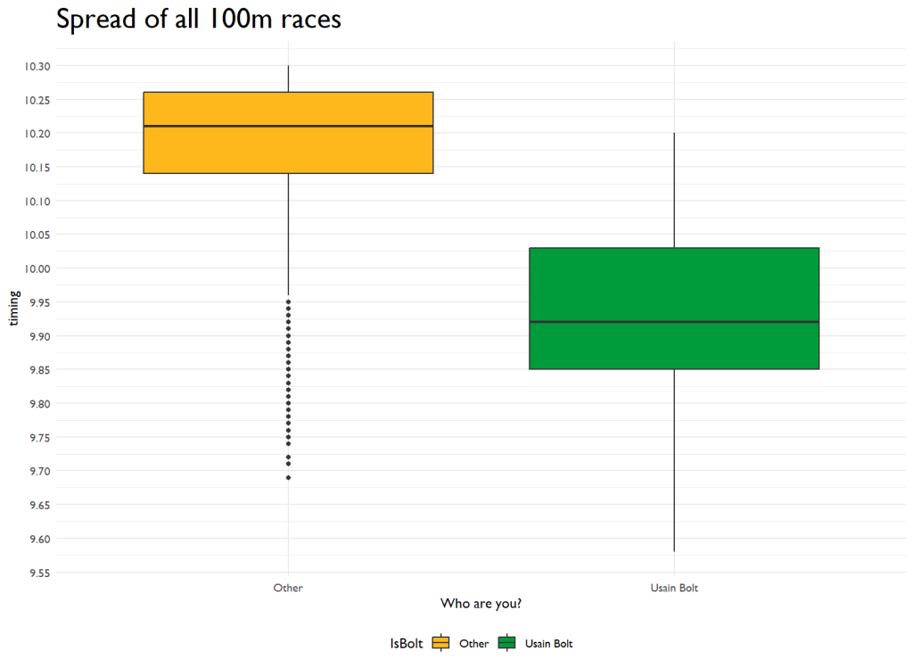
In the above, we can see that Bolt’s median is like 0.3 seconds ahead of the field’s median. Not bad1
I then plotted ALL the times, all ~24,000 of them on a scatter plot to see trends over time. I also changed the aesthetics to show Bolt’s performances.
############# using a linear model ###############
df1 %>%
  ggplot(aes(x=date, y = Mark, color = IsBolt)) +
    geom_point(data = . %>% filter(IsBolt == "Other"), aes(color = IsBolt), alpha = 0.05) +
    geom_point(data = . %>% filter(IsBolt == "Usain Bolt"), aes(color = IsBolt, size = 0.25, alpha = 0.7)) +
    scale_color_manual(values = c("Usain Bolt" = "#009B3A", "Other" = "black")) +
    geom_smooth(data = . %>% filter(IsBolt == "Other"), aes(group = IsBolt, color = IsBolt), method = "lm") +
    geom_smooth(data = . %>% filter(IsBolt == "Usain Bolt"), aes(group = IsBolt, color = IsBolt), method = "lm") +
    theme_minimal() +
    scale_x_date(date_breaks = "5 years", date_labels = "%Y") +
    scale_y_continuous(breaks = seq(floor(min(df1$Mark)), ceiling(max(df1$Mark)), by = 0.05)) +
    theme(legend.position = "none") +
    theme(text=element_text(family="Gill Sans MT")) +
    labs(title = "Usain Bolt vs. the field", x = "year", y = "timing") +
    theme(plot.title = element_text(size=22))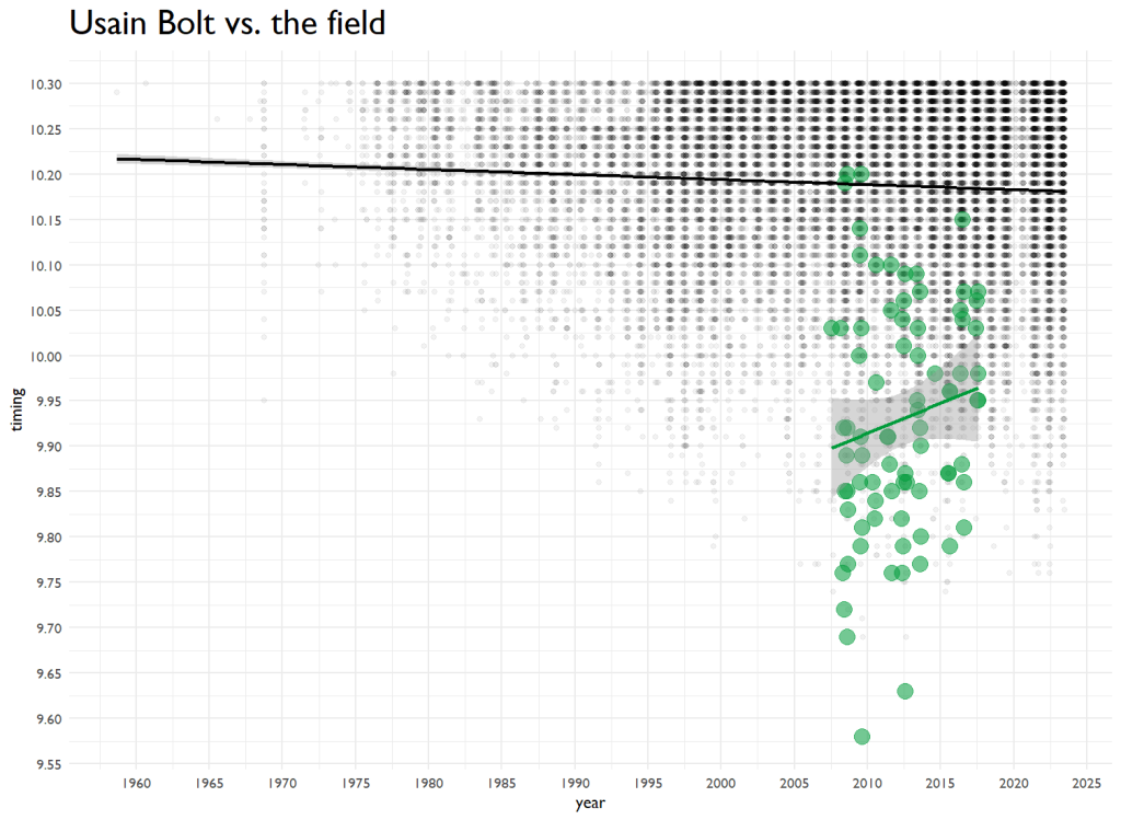
Over the last 60 years, the predicted performance is dropping slightly. Bolt’s went up over time. You know what they say–Father Time is undefeated. I ran a tiny model that sees age’s impact on performance, and it has a tiny but significant effect. And then I have to go and code it up. Here’s 100m time by age.
df1 %>%
  ggplot(aes(x=age, y = Mark)) +
    geom_point(size = 1, alpha = 0.2) +
    geom_smooth(method = "loess", linewidth = 1.5, color = "#009B3A") +
    theme_minimal() +
    scale_y_continuous(breaks = seq(floor(min(df1$Mark)), ceiling(max(df1$Mark)), by = 0.05)) +
    scale_x_continuous(breaks = seq(15, 45, by = 1)) +
    theme(text=element_text(family="Gill Sans MT")) +
    labs(title = "Men's 100m Times by Age", x = "Age",y = "Time") +
    theme(plot.title = element_text(size=22))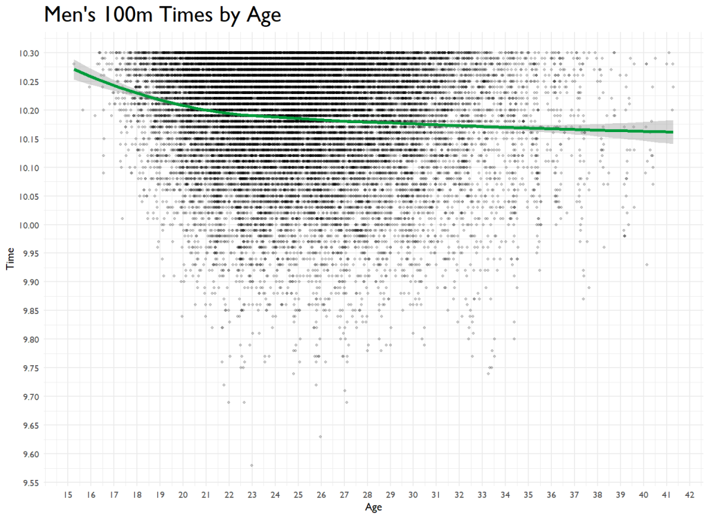
My guess is that things start leveling off because of the lack of data points for Masters. If there was more data, this would no doubt be parabolic.
Quantifying the Difference
This is where Cohen’s d comes in. Cohen’s d is a measure of effect size that compares the difference between two means in terms of standard deviations. In this case, a higher Cohen’s d would indicate a better performance by Usain Bolt than other athletes.
# Calculate Cohen's d
d <- cohen.d(df1$Mark[df1$IsBolt == "Other"], df1$Mark[df1$IsBolt == "Usain Bolt"])

# Take the absolute value
d_abs <- abs(d)
We calculated Cohen’s d and found it to be a whopping 2.72. This is a very large effect size, indicating that Usain Bolt’s performance was significantly better than the average athlete’s. To put this in perspective, Cohen’s guidelines for interpreting d suggest that 0.2 represents a small effect, 0.5 a medium effect, and 0.8 a large effect. Therefore, a Cohen’s d of 2.72 highlights just how far Bolt’s performance was from the average. By multiplying this by the standard deviation, being Usain Bolt was worth 0.26 seconds over the 100-meter dash. WHOOOOOSH.
Conclusion
Usain Bolt was fast.
But, we met our goals. We got the data without too much fuss. And we killed an hour visualizing some fun data.