
In today’s data-driven world, understanding key statistical concepts is vital. One such concept is Regression to the Mean. Often encountered in fields like healthcare, finance, and sports analytics, it is pivotal in predictive modeling and data analysis. This comprehensive guide will delve deep into this concept with a practical illustration using R programming language. By the end of this guide, not only will you grasp the concept, but you’ll also witness it in action through R code. Let’s get started!
What is Regression to the Mean? A Detailed Explanation
The term “Regression to the Mean” denotes a statistical phenomenon where data points that are initially extreme are likely to be followed by less extreme data points, gravitating towards the average. Imagine a basketball player who scores significantly above their average in one game; the principle of regression to the mean suggests that their performance in the subsequent games is likely closer to their average performance level.
Understanding why this happens can be a game-changer in making informed decisions and predictions in various professional fields. It predominantly occurs because the initial extreme data point (like the high score of a player in a single game) may be influenced by various factors, including luck, which may not be present to the same degree subsequently. Thus, the following data points are closer to the mean or average.
A Step-by-Step R Code Tutorial Illustrating Regression to the Mean
To make this concept more tangible, let’s walk through an illustrative tutorial using R, a prominent programming language favored by statisticians and data analysts worldwide. Don’t worry if you’re new to programming; we’ll guide you through each step.
# Load the necessary package for data visualization
library(ggplot2)

# Set a seed for reproducibility
set.seed(1701)

# Generate 250 random data points for variable X
X <- rnorm(250, mean = 50, sd = 10)

# Generate 250 random data points for variable Y, with some relationship to X
Y <- 0.5*X + rnorm(250, mean = 0, sd = 10)

# Create data frame and calculate means
df<- data.frame(X, Y)
df$deviation_X <- abs(data$X - mean(data$X))
df$deviation_Y <- abs(data$Y - mean(data$Y))

# Plot the data points and the regression line
ggplot(df, aes(x = X, y = Y)) +
  geom_point(aes(color = deviation_X), size = 3) +
  geom_smooth(method = "lm", se = FALSE, linetype = "dashed", color = "blue") +
  geom_hline(yintercept = mean(data$Y), linetype = "dashed", color = "red") +
  geom_vline(xintercept = mean(data$X), linetype = "dashed", color = "red") +
  annotate("text", x = mean(data$X), y = max(data$Y), label = "Mean of X", hjust = 1.5) +
  annotate("text", x = max(data$X), y = mean(data$Y), label = "Mean of Y", vjust = 1.5) +
  theme_minimal() +
  scale_color_gradient(low = "darkblue", high = "lightblue") +
  labs(title = "isualization of Regression to the Mean",
       x = "Variable X",
       y = "Variable Y",
       color = "Deviation from Mean of X") +
  theme(legend.position = "top")  +
  theme(text=element_text(size = 14, family="Gill Sans MT"))
Breaking Down the R Code
- We initiate by loading the
ggplot2package, a powerful tool for creating graphics in R. - To make our random number generation consistent, we set a seed.
- We craft a set of 100 data points for a variable
X, centered around a mean of 50 with a standard deviation of 10. - Similarly, we establish another 100 data points for
Y, which is moderately influenced byX, but also includes random variations. - Finally, we plot the data points and overlay a regression line to represent the regression to the mean visually.
Let’s delve a bit deeper into the nuances of this.
In the script, we have two variables: X and Y. Y is somewhat dependent on X but also has a random component introduced to it. This simulated dataset echoes real-world data where multiple factors can influence an outcome (Y), including one or more measurable variables (like X) alongside other random, potentially unmeasured influences.
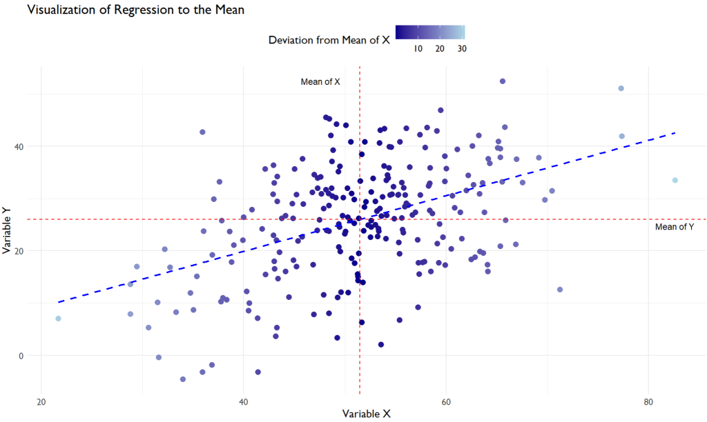
The Plot
As you scrutinize the scatter plot, you will notice a congregation of data points around a central axis, characterized by the mean values of X and Y, represented by the red dashed lines in the plot. This graphical representation allows us to visibly ascertain the tendency of data points to cluster around a central value, a graphical manifestation of the regression to the mean concept.
Further, the color gradient in the scatter plot facilitates a deeper understanding of this phenomenon. Points that are dark blue represent data points that are farther away from the mean value of X. As per the principle of regression to the mean; these extreme values are likely to be followed by data points closer to the mean in subsequent measurements, represented by the lighter blue points in the scatter plot. The transition from light blue to dark blue visually encapsulates the regression to the mean, indicating a ‘return’ to average values over time or a series of events.
Moreover, the blue dashed line, which is the regression line, visually encapsulates the general trend in the data. It highlights that as X increases, Y tends to increase as well. Still, not in a strictly linear manner due to the random component added to Y. This randomness results in a scattered pattern around the regression line, illustrating that the subsequent values (Y) are not perfectly predictable from the initial values (X) and are influenced by other factors, thus gravitating towards the mean over a series of data points.
So, when you observe this scatter plot, it visually validates the concept of regression to the mean, offering a graphical representation of how extreme data points are generally succeeded by data points closer to the central tendency, emphasizing the omnipresent influence of average values in a dataset.
Wrapping Up: The Significance Regression to the Mean
Understanding the nuances of regression to the mean can be a powerful asset in various professions, promoting astute decision-making and forward-thinking analyses. More than just a statistical phenomenon, it is a vital instrument widely embraced in contemporary data analytics. This insight transcends being merely a statistical marvel, morphing into a formidable tool that facilitates precise predictive modeling and analysis, thus bolstering informed strategies in diverse domains, including finance, healthcare, and sports analytics.
Keep an eye out for more enlightening content that seeks to expand your knowledge horizons in the fascinating world of statistical concepts and data analytics.