Our ability to make sense of voluminous and multi-dimensional data is ever more critical in an increasingly complex and interconnected world. One area where this is particularly prominent is the visualization of intersectional data. Intersectionality, a term coined by Kimberlé Crenshaw in the 1980s, refers to the interconnected nature of social categorizations such as race, class, and gender, creating overlapping systems of discrimination or disadvantage.
Visualizing this type of data presents a unique set of challenges because it involves not just representing different categories of data but showing their complex interactions and intersections in a meaningful and readily understood way. This article delves into some of the main challenges of visualizing intersectional data.
Multidimensionality
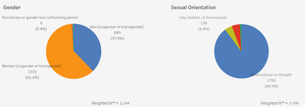
Intersectional data is inherently multidimensional, making it more complicated to visualize than simpler, unidimensional data. This complexity increases exponentially with the addition of each new dimension or category. Traditional visualization techniques like bar charts or pie charts can only effectively handle two or three dimensions. While there are multidimensional techniques like parallel coordinates or radar charts, they can become increasingly difficult to interpret as more dimensions are added.
Overlapping Categories
Intersectional data typically involves overlapping categories. For example, a person could belong to multiple demographic groups (e.g., female, Asian, middle-class, etc.), and the overlap of these categories can have unique impacts. Showing these overlaps visually can be challenging, as it requires a visualization method that can effectively display intersecting categories without causing confusion or misinterpretation.

Scale and Granularity
Intersectionality often requires dealing with data on various scales and levels of granularity. For instance, the effects of intersectionality might be different at the individual, community, and societal levels. Similarly, these effects might vary across different geographical regions or time periods. Presenting all these aspects in a single visualization can be an enormous challenge, given the need to maintain clarity and accuracy while ensuring the visual representation is not overwhelmingly complex.
Bias and Misinterpretation
A significant challenge with visualizing intersectional data is the risk of bias and misinterpretation. This can occur when the visualization unintentionally amplifies certain aspects of the data while minimizing others, leading to skewed perceptions. This risk is heightened in intersectional data because the complexity and multidimensionality can easily lead to oversights or misrepresentations if not handled with care.
Accessibility and Inclusivity
Visualizing intersectional data requires an emphasis on accessibility and inclusivity. This is because intersectionality aims to highlight the experiences of marginalized or disadvantaged groups. Therefore, the visualizations must be accessible to a diverse audience, including those with visual impairments or cognitive differences. This calls for careful choice of colors, shapes, and symbols and alternative text descriptions or tactile representations for those who can’t access visual content.
Finding Solutions
While visualizing intersectional data poses significant challenges, several strategies can help address these. For instance, combining visualizations rather than relying on a single chart can help represent multidimensionality. Storytelling techniques can aid in conveying complex overlaps and interactions, while user testing and feedback can mitigate risks of bias and misinterpretation.
Moreover, advances in visualization technology, such as VR and AR, offer new possibilities for presenting intersectional data in immersive and interactive ways. However, these technologies also raise their own challenges and should be used with sensitivity to the complexities and nuances of intersectional data.
In conclusion, visualizing intersectional data is a complex task that requires a careful balance of clarity, accuracy, and inclusivity. However, with careful planning and execution, it can lead to a deeper understanding of the intricate ways in which different categories and identities intersect and influence each other.
Recommended Reading
To dig much deeping into this, check out Data Feminism by Catherine D’Ignazio and Lauren F. Klein. Full Stop– one of the greatest books I’ve read in a long time on community-based participatory data collection.

