This is another one of those “writing a blog while I’m working” blogs. For the Rhode to Equity project, we administered three waves of the P2PH Compass. This tool actually warrants some discussion up-front.
The Compass measures a variety of capacities for community health engagement and improvement on a developmental scale. We designed the Compass to be both an assessment tool, while also functioning as a coaching and facilitation support tool. The idea is that teams individually take the Compass, then come together to discuss their scores and the meaning of those scores. We’ve been using it, and derivatives of it, in many, many projects over the past six years, but one of of the challenges comes to visualizing change with this data. Let’s take this graph first.

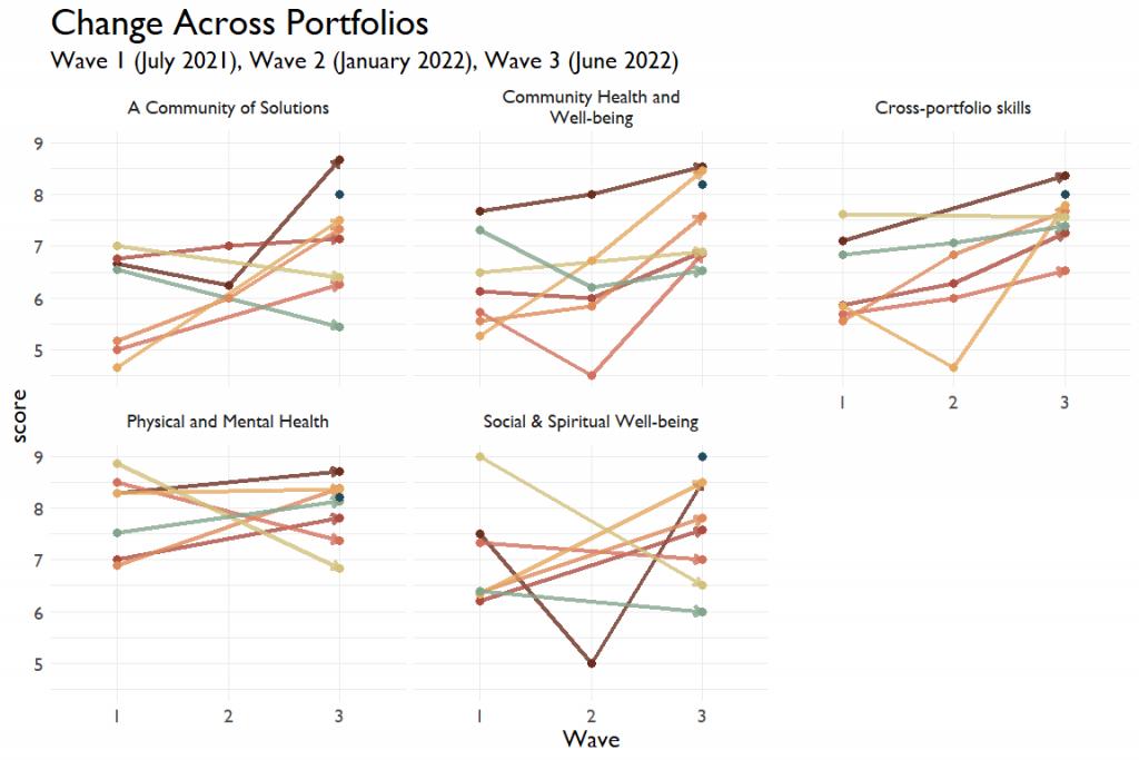
Here, I’m showing six-ish teams’ average scores by administration wave by portfolio. If there’s a lot of within-group variation here, it might be getting washed out in the visualization. Also, note that the range of the left-hand side is restricted. When I show everything on the standard zero to ten scale, any changes look super minuscule. But maybe that’s not a problem? To check, I ran a super-simple regression to see whether the change in scores is a function of the wave, controlling for team and portfolio. And, yup, yeah, these mattered (F (12,1735) = 28.75, p < 0.001)
Deepening Collaboration
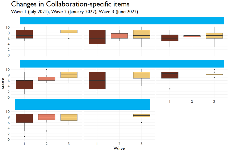
A subquestion that we were interested in was whether the team deepened their collaboration over time. I cut out the teams names to preserve their anonymity. It’s a lot easier to see the growth here among these teams, which is born out by the regression. (F(1,505) = 63.58, p < 0.001). I used boxplots to visualize the spread of scores, but could have also chosen jitter or swarms plots.

Pretty neat. It’s really important to be able to see the variation in the score because that can tell us where there might be misalignment within the teams. A tighter spread is indicative of increasing agreement, which is good to see!
