
Let’s resurrect another old post! This was published back in August 2020.
It’s not quite Labor Day in the US, but the last days of summer are winding down. Last week, I took a look at the past few months of evaluation research. Today, let’s take a look at what’s been going on in the implementation science space.
Consolidating all of this literature is a bit challenging since it tends to be scattered across many different outlets. One resource that I found especially helpful is this resource from the people at the University of North Carolina. Like before, I pulled all the abstracts from a few key journals:
- Implementation Science
- Implementation Science Communications
- BMC Health Services Research
- BMC Public Health
- Translational Behavioral Medicine
- Journal of Public Health Management and Practice
- Health Promotion & Practice
- Administration and policy in mental health
- Milbank Quarterly
- BMJ Quality and Safety
- I also added the brand new Implementation Research and Practice (IRP) (though there are only six articles within the last 101 days)
This process yielded 705 articles. But let’s take a quick contextual detour.
Lately, I’ve been tracking appears with this #impsci tag on Twitter (note from the present. This data is much harder to come by these days since Twitter/X made their API more restrictive). Below are this week’s results. What this tends to show is that implementation science is very health-focused. In fact, the new IRP focuses exclusively on the behavioral health sector. I get it; there need to be some constraints on content in order to sharpen both a journal’s scope and to aid in the review process. I can’t help but think we’re missing a lot of quasi-implementation science research because of the health focus.

This focus on health is absolutely reflected in this network graph of the frequently occurring phrases. This graph shows which work pairs (or, in some cases, phrases) that happened in the abstracts. The larger cluster in the upper left-hand side clearly shows the health and systemic focus. Other pairs are more methods-focused, with the exception of the social media(um) connection. And, of course, COVID-19 rears its ugly head.

So, moving on to another analysis, I was also interested in the structure of the topics. The topic model presupposes that “topics” are clusters of words and “documents” are clusters of topics. I used the straightforward Latent Dirichlet Allocation (LDA) to get at this clustering. I ran an LDA loop to determine the optimal number of topics by reducing the perplexity score, then pulled the top five keywords per topic. I talk more about this in an earlier post. This is what is shown in the graph below. One challenge with LDA is that the topics may not be human interpretable, though this is also a broader challenge in all sorts of machine learning research. Some of these topics are pretty intuitive, though. Topic 4 seems to be about tobacco use; topic 9 seems to be about opiate abuse and overdose. Topic 22 appears to be about Implementation Science’s recent article type, standby, and systematic reviews. I run into topic six a lot in other applications, and I guess that there needs to be a better preprocessing step to address both the character encoding and whether the 95% confidence interval (the “95” and “CI”) is worth keeping.

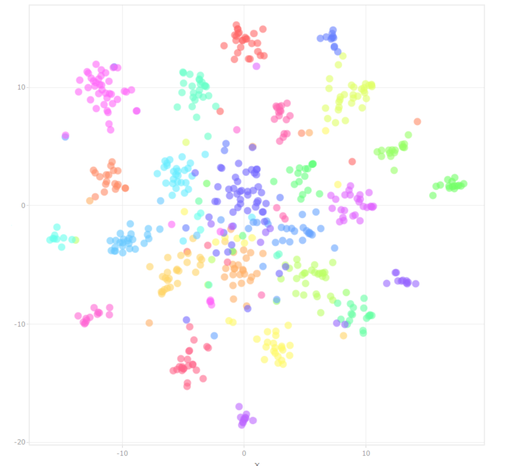
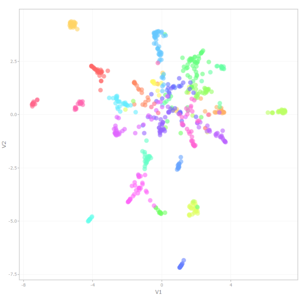
In a previous analysis, I had been using T-distributed Stochastic Neighbor Embedding (t-SNE). This is a dimensionality reduction algorithm that aids in visualization, kind of like a PCA. In this case, I took the 25 potential topics that an article could be assigned to and reduced it to two. The graph below is colored by topics, whereby each point represents a single article. More recent research indicates that the Uniform Manifold Approximation and Projection (UMAP) algorithm does a better job of preserving global relationships (in addition to being faster to compute). Check out this incredible site. I put both topic cluster graphs below. TSNE is on the right, and UMAP is on the left. I like the UMAP version more, though I need to do some more research on the hyperparameter tuning to make it more effective. Don’t @ me, I know. I’m also working on getting an interactive version of this graphic up and available for people (as soon as I figure out the WordPress coding for it.)
So, wrapping up, does this tell us anything about the state of the science? Looking across 705 articles, we can see a clear focus on health intervention, as well as a focus on methods. I’m a methods guy myself, so I can’t begrudge that. It would be helpful, though, if the field started focusing more on how implementation connects to outcomes so we can really supercharge the value of this work.
Plug from the Present
Empower your nonprofit with the right funding strategy! Our Nonprofit Revenue Readiness Meter is designed to assess your organization’s current financial health and identify the most effective funding models for your cause. By participating, you’re taking a critical step toward financial clarity and sustainability. Join other forward-thinking leaders in the nonprofit sector and take the survey today!